Helping people
in their stride.
About Stride
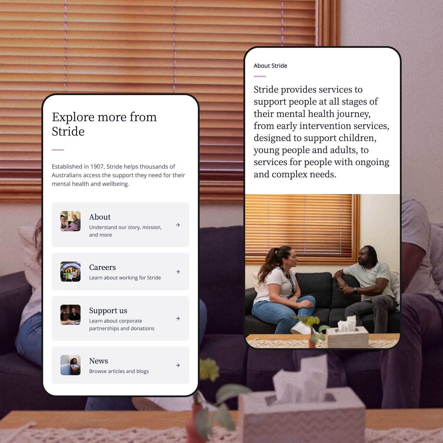
Established in 1907, Stride is one of Australia’s most experienced mental health service providers. They support children, young people, adults, families, and carers across the country – offering everything from early intervention and community programs to NDIS support, residential services, and suicide prevention. With more than 60 services nationwide, Stride helps thousands of Australians find a path forward, wherever they are in their mental health journey.
What did we need to solve?
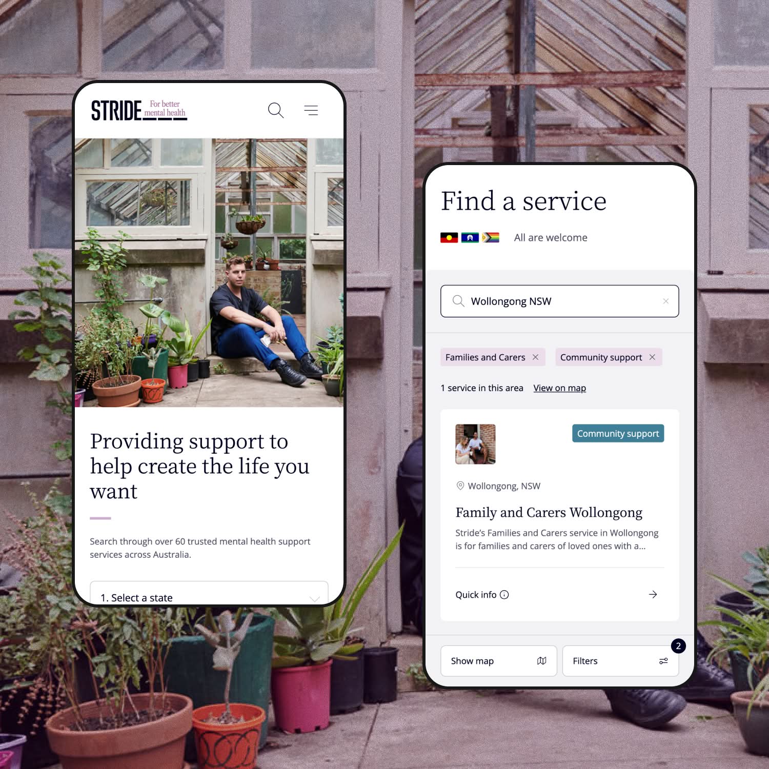
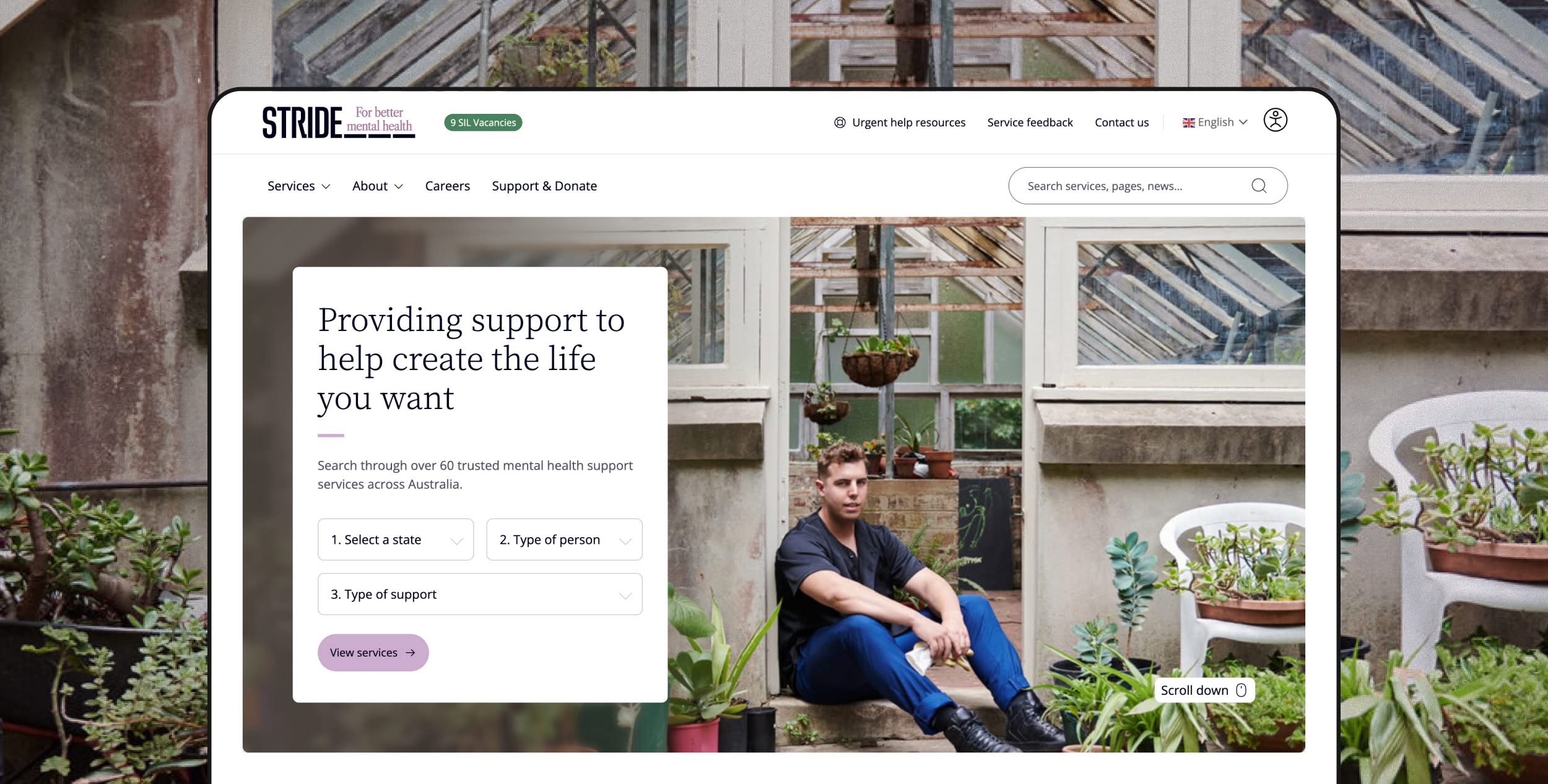
Stride’s breadth of services is one of their greatest strengths – but it created a real challenge online. The old site made it hard for visitors to understand what was available to them and how to get started. With audiences ranging from parents of young children through to adults in crisis, the information architecture needed to do serious heavy lifting. When someone is looking for mental health support, friction isn’t just inconvenient – it can be a barrier to getting help at all. The site needed to be rebuilt from the ground up with clarity as the core principle.
Awards
2026 AWA award – Winner – Not-for-profit
2026 AWA award – best-in-show – Content
2026 AWA award – finalist – Community & Culture
2026 AWA award – finalist – WordPress
How we approached the project
We took on the full project – strategy, UX, design, development, CMS build, and SEO. The first job was getting the information architecture right. With services spanning four distinct audience groups – kids, young people, adults, and families and carers – we designed clear pathways for each, so visitors could orient quickly and find what was relevant to them without having to wade through everything else. The service finder became a key feature, letting people search and filter across 60+ services by state and support type. From there, the design and build brought it all together in a way that felt calm, warm, and trustworthy – exactly the tone you need when someone is reaching out for help.