Not-for-profit website design: Why information architecture is the real challenge
Most not-for-profit website design briefs start in the wrong place. They start with colours, fonts and homepage layouts, when the real problem is almost always structural: how do you organise a large, complicated service offering so it makes sense to the people who need it, fast.
It’s a pattern we see often across not-for-profit organisations. The causes are different, but the underlying challenge in website design for charities and not-for-profit organisations is nearly always the same: a lot of valuable content, several very different audiences, and no room for friction.
What makes not-for-profit website design harder than a standard rebuild?
Not-for-profit website design is harder than a standard rebuild because one site has to serve multiple audiences, carry a large volume of content, and support a mission-critical outcome, all at once.
Sacred Heart Mission is a Melbourne-based not-for-profit that has supported people experiencing homelessness since 1982, through daily meal services in St Kilda and 13 Op Shops across Melbourne’s suburbs, alongside work addressing violence, food and income insecurity, and mental health. Its site had to serve people seeking help directly, caseworkers acting on someone’s behalf, donors, volunteers and the SHM team internally, each with different needs and different levels of urgency.
No amount of good web design solves that on its own. We ran a discovery workshop with the SHM team, then did user research with people who use the site day to day, including caseworkers who told us they were often searching on behalf of someone in an urgent situation. That research uncovered a navigation problem no visual concept would have caught: the site needed fast, accessible paths to urgent information for people acting on someone else’s behalf, alongside a separate, trustworthy donation flow for supporters. For not-for-profit website design at this scale, the structure has to come from research, not a template.
How do you design a website for four different audiences at once?
You design for four different audiences by building separate, clear pathways for each one, rather than a single generic structure everyone has to work around.
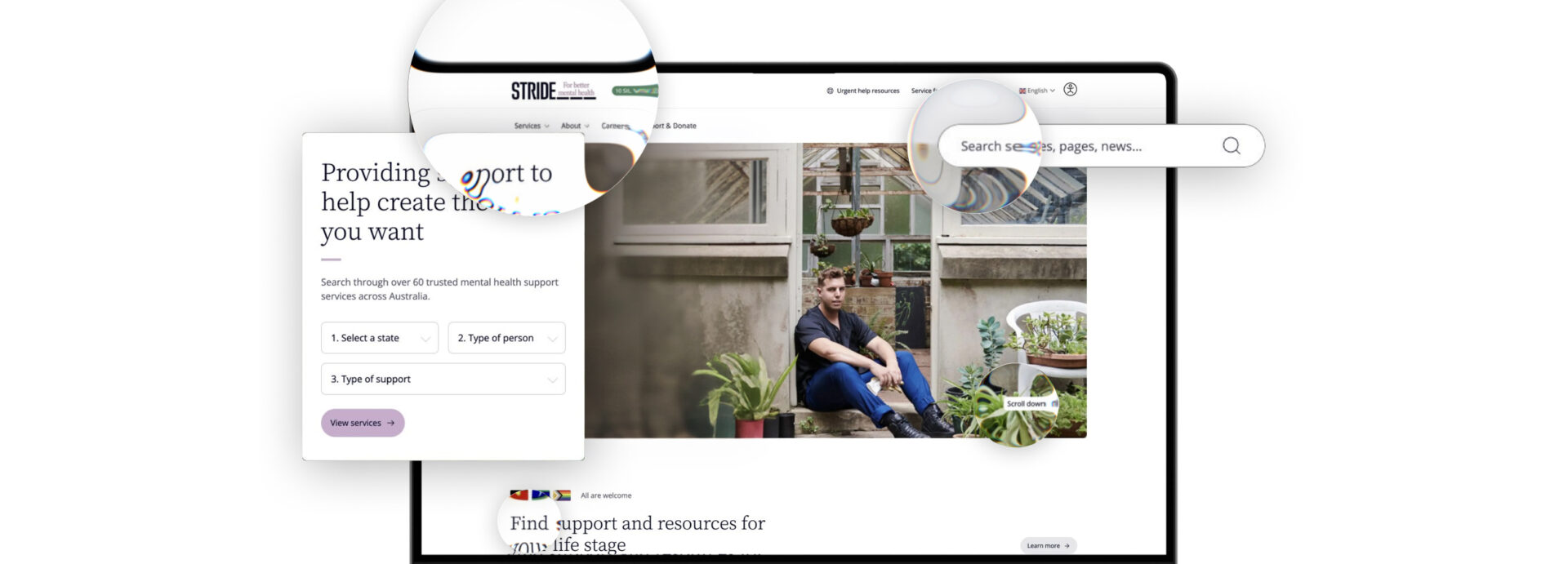
Stride Mental Health Services has supported Australians since 1907 and now runs more than 60 services nationwide, spanning children, young people, adults, and families and carers. Their old site made it hard to tell what was on offer or how to get started, and for someone reaching out about mental health support, that kind of friction that can prevent someone from getting help at all.
We rebuilt the site around four distinct audience pathways, with a service finder that lets people filter more than 60 services by state and support type. This is where website UX for nonprofits differs most from standard web design: each audience needs its own route, not a compromise between all of them.
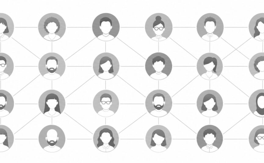
Why the person searching your website isn’t always the person you built it for
The person using a not-for-profit website often isn’t the person the content was written for. It’s frequently someone acting on their behalf, a caseworker searching for urgent information, a family member trying to find support for someone else, an advocate filling in a form on a client’s behalf.
That’s an easy thing to miss when a brief is written around the “end user” as a single, direct visitor. Usage data tells a different story more often than not. It shows who’s actually typing the search terms, which pages they land on under pressure, and how fast they need an answer. Designing for that second, often invisible audience changes what “urgent information” needs to look like, and where it needs to sit.
Accessible website design for charities isn’t only about compliance. It’s about who’s really on the other end of the screen.
How do you structure a website with thousands of resources without overwhelming users?
You structure a large resource library by testing how real users categorise your content, rather than relying on how your organisation categorises it internally.
The Healthy Eating Advisory Service (HEAS) has supported more than 3,100 organisations across 99% of Victoria’s local government areas, reaching an estimated 1.3 million Victorians. That’s a large library of guidance and resources, much of it built for specific, niche groups.
We ran open and closed card sorting with the HEAS team and real users to work out how people actually think about that content. User behaviour data showed recipes mattered most to the public, while case studies mattered most to managers, and that split shaped the navigation and search. Getting the terminology right also mattered given the legal nature of some of the content, so accuracy sat alongside usability. This is the difference between nonprofit web development done properly and a generic content dump with a search bar bolted on.
What should a not-for-profit look for in a website redesign?
A not-for-profit should look for a partner who researches audiences and usage before designing anything, not one who starts with visual concepts.
A few patterns hold true across some of the best not-for-profit websites in Australia:
- Map your actual audiences before you map your sitemap. “General public” is rarely one group.
- Test who’s really using the site. It might not be who you assumed.
- Let real usage data decide navigation priority, not internal org charts.
- Treat clarity as a design outcome, not just a design preference.
- Build in accessibility and clear donation or contact pathways from the start, rather than retrofitting them later.
None of this starts with a colour palette. Genuine web design for not-for-profits starts with understanding the people using the site well enough to build around them.
Work with a team that’s done this before
We’ve built information architecture and full website design for organisations ranging from medical research institutes to mental health providers, homelessness services and government-funded health programs, including Stride’s site, recently nominated for Not For Profit at the Australian Web Awards. If you’re planning a website redesign and want a team that starts with research rather than templates, we’d be glad to talk through what that discovery process would look like for your organisation.
Get in touch with Sod
What is information architecture in website design?
Information architecture is how content, pages and navigation are organised so people can find what they need with minimal effort. For not-for-profit website design, it’s the difference between a site that gets people to help, information or a donation quickly, and one that buries it.
What makes a not-for-profit website design agency different from a standard web design?
A not-for-profit website design agency starts with audience research and usage data, not visual concepts. NFP sites often serve several distinct audiences with different needs, urgency levels and digital confidence, so the structure has to be built around real behaviour rather than an aesthetic design template.
How can a not-for-profit website attract more donations?
A not-for-profit website attracts more donations when the donate button sits in the same, visible position on every page, and the pathway from click to confirmation takes as few steps as possible. That means no forced account creation, minimal form fields, and payment options users already trust. Removing friction at each step matters more than persuasive copy once someone has already decided to give.
Do not-for-profit websites need different accessibility standards to other sites?
Not-for-profits should meet the same accessibility standards as any organisation, and often need to go further, since users may be searching under stress, in a crisis, or on behalf of someone else. Accessible website design should be treated as core to the brief, not an add-on.
-
![]()
Multi-location marketing for franchise brands: how to scale local visibility
Sep 2026 4 min read -
![How AI search is changing the property buyer journey banner]()
How AI Search Is Changing the Property Buyer Journey
Sep 2026 4 min read